Power BI Tutorial
The complete Power BI Tutorial journey covers all about the BI technology Microsoft Power BI. There are many interesting insights and information on the BI Technology provided in this Tutorial. There are different topics covered in the Tutorial that is required for passing the Power BI certification. Therefore it acts as the best Power BI Tutorial for Fresher, Experienced professionals, and Beginners.
The Power BI Tutorial for beginners acts as the best building block to know about the Power BI Technology in-depth. Data visualization and Business Intelligence are two main topics to check out in this Power BI tutorial. The Tutorial is for all audiences, and it helps to understand the fundamental and advanced concepts of Power BI in detail. The Tutorial will provide a good understanding of the Power BI, which will take the fresher, beginners, and experienced professionals to a higher level of expertise.
Business Intelligence
Business intelligence is a concept or technique of transforming raw data into structured and meaningful information with various sets of tools. It helps in effective business planning. Business intelligence can be used to tackle a lot of data. Basically, there are three types of usage in BI:
IT to End-User
End-Users cannot make their own reports or visualization as they don’t have sound technical knowledge. So, they are dependent on the IT department of a company for delivering the same. This will consume more effort and time.
Analyst to End-User
Analysts are given the task of performing data analysis. They have proper knowledge of BI tools and their expertise lies in delivering crucial reports to the end-users which eases the role of the IT department.
End-User
This wave is basically for users who have basic knowledge of data analysis and BI tools like Power BI etc. Anybody who has some understanding of these kinds of tools can create dashboards and reports as per their need and it reduces their cost and time at the same time.
Data Visualization
In simple words, data visualization can be called as a pictorial or graphical representation of data. It provides key insights from large and complex data by interacting with the key information of the data. The below image shows the basic concept of data visualization.
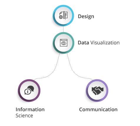
Bar charts were the first kind of charts invented in the late 18th century for quantitative comparison. Data visualization is easier to convey key information and hidden patterns. It will give better insights and analyze the complex data to make proper predictions. Visualization can be in the form of a chart, graphs, etc. Softwares and tools like Excel, Tableau, Power BI, etc. have dozens of techniques for plotting visualization charts and graphs.
Power BI
Power Bi is Microsoft’s solution for data visualization, analysis and cloud services. It is an interactive visualization tool with self-capable BI capabilities, where end users can create reports and dashboards without having prior experience or help of IT staff. Data can be imported from various databases or inserted manually.
Power BI Services, a cloud base BI solution will help you create and share reports with teams/clients. Basically, it is capable of the data warehouse as well as data sharing. Power BI can connect SQL Server databases, a local source like desktop and many other data sources to the dashboard for creating better reports without having to work from scratch as shown below.
Why is Power BI needed?
- There are other tools like Tableau, Qlikview, etc. but they restrict users to historical analysis. But Power BI allows real-time information so that we can identify early trends and improve performance.
- Power BI searches data sets for hidden insights in a few seconds of time. It helps in answering queries immediately.
- Not only real-time analysis, but Power BI also allows users to use custom visuals apart from those present in the tool.
- Power BI has a desktop, server-based client to connect to both on-premises data sources as well as from databases like SQL, MS Access, etc. That is why Power BI is always enterprise-ready.
Components of Power BI
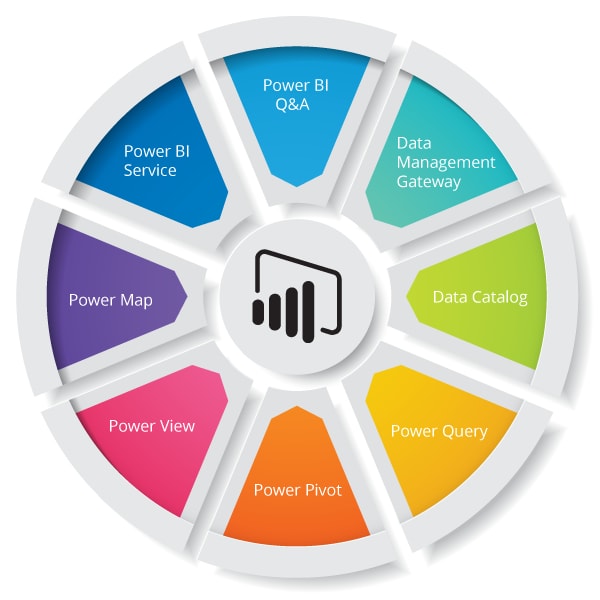
- Power Query: It is used mainly for search, access and transform public and internal data sources.
- Power Pivot: Mostly used for creating pivot like table or data modeling for in-memory analytics i.e will create a pivot from the existing table.
- Power View: Power View analysis, visualizes and displays data in an interactive manner.
- Power Map: It is a geographical visualization component for plotting interactive geo-maps from the data.
- Power BI Service: As mentioned above, it is a cloud-based solution for sharing data views and workbooks to various clients.
- Power BI Q&A: It is a helping solution from Power BI which will give immediate answers with the help of natural language queries.
- Data Management Gateway: It is used in the on-premises environment to copy data between cloud and on-premises or local data stores. We can get periodic data refreshers and view data feeds with this component. It should be installed before use.
- Data Catalog: Any user can easily find and use the queries multiple times using this feature.
Power BI Architecture
The below image shows how Power BI works from scratch till the end.
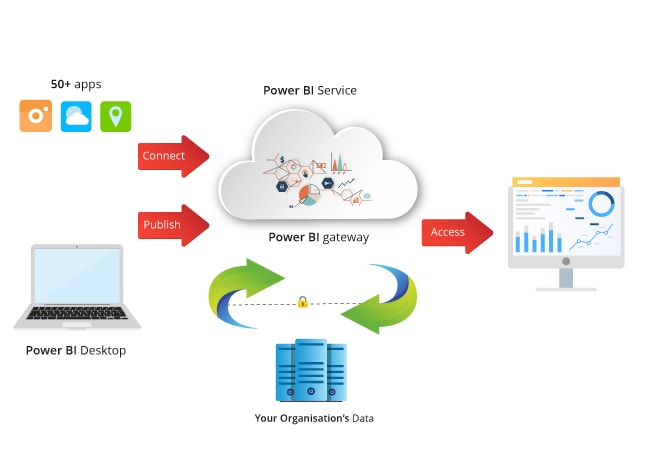
There are basically three phases in Power BI. The first two phases partially use ETL to handle data. ETL is Extract, Transform, Load. Let’s look at some features of Power BI below.
- Data Integration: Data can come from different sources in different formats. First of all, data is extracted from different sources or databases and then integrated into a common format and then stored at the staging area.
- Data Processing: The data integrated before are not visualized unless it is processed. The same data is pre-processed. If we have missing or duplicate values, then they are removed from the data set. After then, certain rules are applied and then data is transformed in a presentable format. The transformed data is then loaded into Data Warehouse.
- Data Presentation: After the data is processed, it can now be visualized in Power BI with a lot of techniques. The reports and dashboards prepared help businesses to make correct decisions based on the insights.
Building Blocks of Power BI
Building blocks are nothing but the types of features we work on in Power BI. There are some basic building blocks as mentioned below.
Visualization
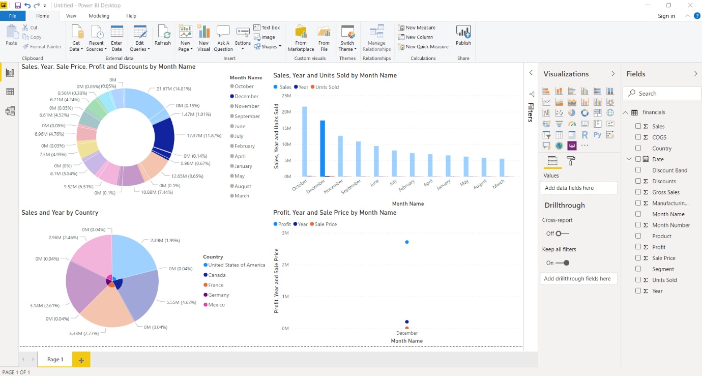
A visual or pictorial representation of data is known as data visualization. Data visualization is the solution of presenting data in an interactive manner which will give more insights from the data set. Power BI gives you different visualization techniques like Map representation, Card Visualization, Stacked chart, TreeMap, Heat Map, Pie & Bar charts, etc. A normal user with limited knowledge can do visualization in Power BI with the help of all the tools available in it.
Datasets
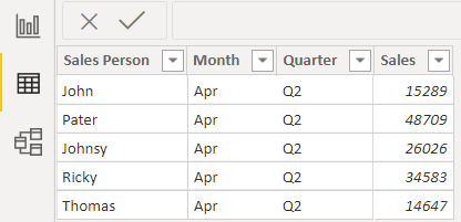
Dataset is the collection of data. The dataset can be imported to Power BI and then reports and visualizations can be created from it. It can be a simple dataset or a combination of multiple data sources. Data collected from different data sources can be combined and filtered into a single data set. We can pull data together from different data sources like SQL Server, MS Access or local source like MS Excel. When the data is filtered, we can focus on the important and required data. Next, when the dataset is ready, we can create visualizations and display different insights from the data in a meaningful way. An example of a Power BI dataset is shown below.
Reports
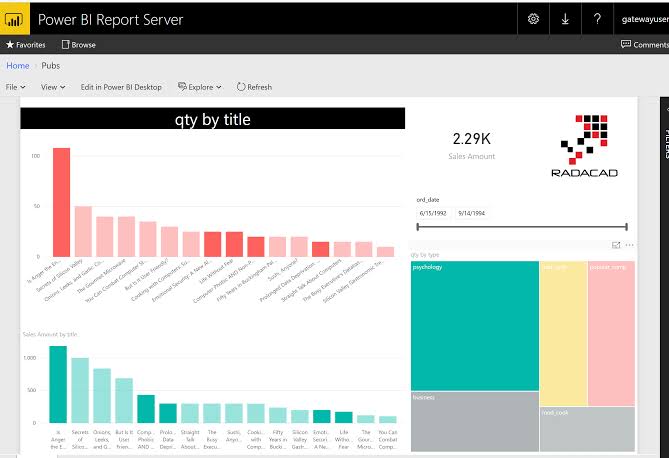
A report is a collection of visualizations that are made on one or more pages. But the collected items are related to each other. It means visualizations can be created in multiple pages if needed but they should be arranged together to tell a meaningful story out of it. This story is known as a report.
The report can be created in different visualization software apart from Power Bi. But, Power BI is the simpler and most useful tool to plot graphs and charts. Let’s look at a sample report below.
Dashboards
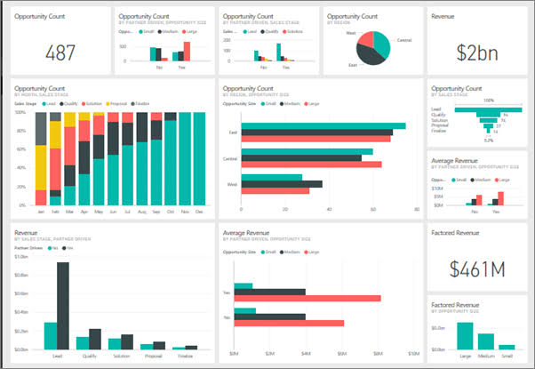
Unlike a report, A dashboard in Power BI is a one-page interface which is also known as canvas. The dashboard uses visualizations to present an appealing report. But it holds only significant data in it.
Power BI has a single visualization that is called tile and imported from a report. Basically, it’s the rectangular box that contains each visual. Power BI has the option of moving or arranging tiles to present the data in our own terms while creating a report or dashboard. Tiles can be made bigger or smaller or in whichever way we want. A sample dashboard can be seen below.
After understanding the basics and architecture of Power BI, its time to understand how to create a Power BI report. But before that, let me guide you what are the pre-requisites for this.
- Power BI Desktop: This is the software which is needed to be installed in the system running Windows OS. It can be downloaded from the Power BI website.
- Next, we need to log in with an organizational email ID i.e an ID of college or workplace. Without the ID, we can’t create account nor access to Power BI service to publish reports or dashboards. Personal email ID’s won’t work here.
- After everything is set, we can import a dataset from a data source and work on it.
How to create a report in Power BI
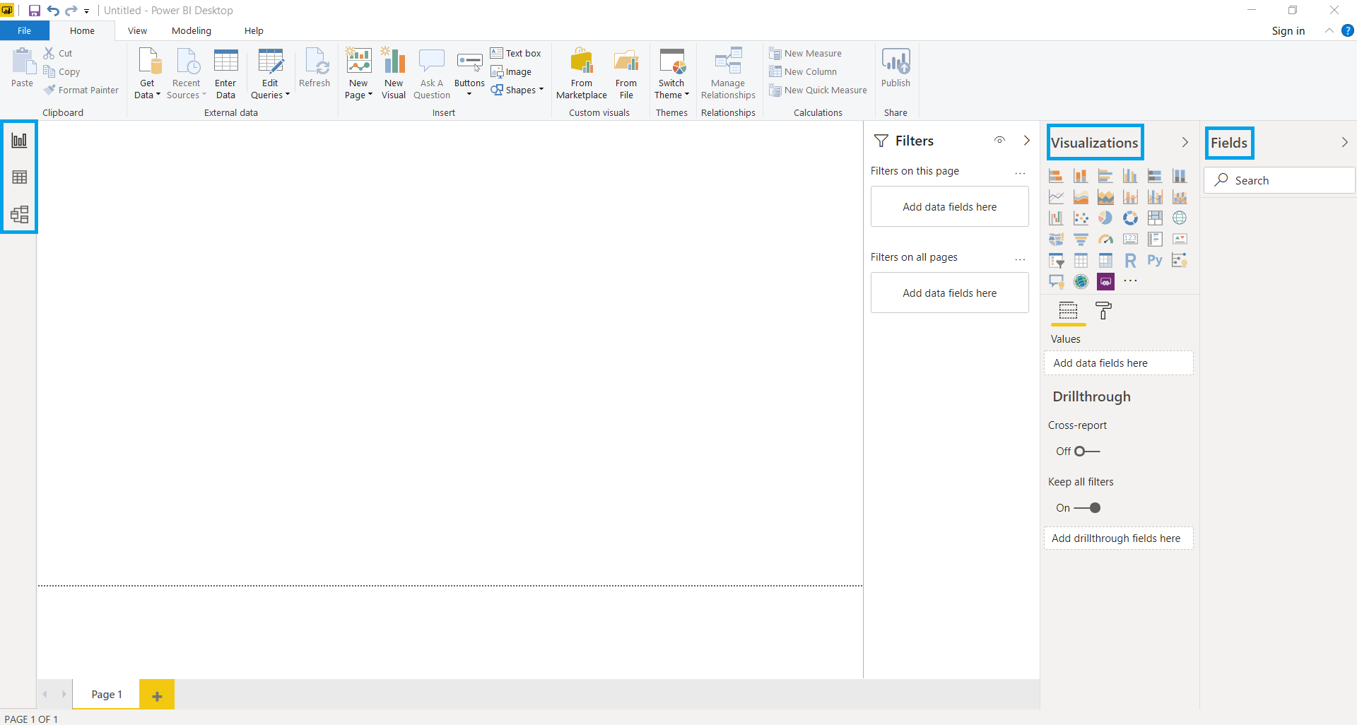
Let us go from scratch to understand how Power BI report works. The image below shows the Power BI Desktop’s interface. On the left side, we can see three tabs which are reports, data, and relationships. While opening Power BI, the report tab opens by default. The report workplace is the place where we create reports. The data workspace shows the imported data sets. And the final tab which is the relationship tab shows the relationship between multiple variables in a data set. And on the right side, we can visualizations and fields workspace as highlighted below
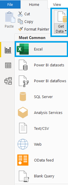
The next step is importing data from a source. We can click on the “Get data” on the top as shown below and select the required data source from it. For example, we have the dataset as an Excel file, we’ll select Excel from it as shown below.
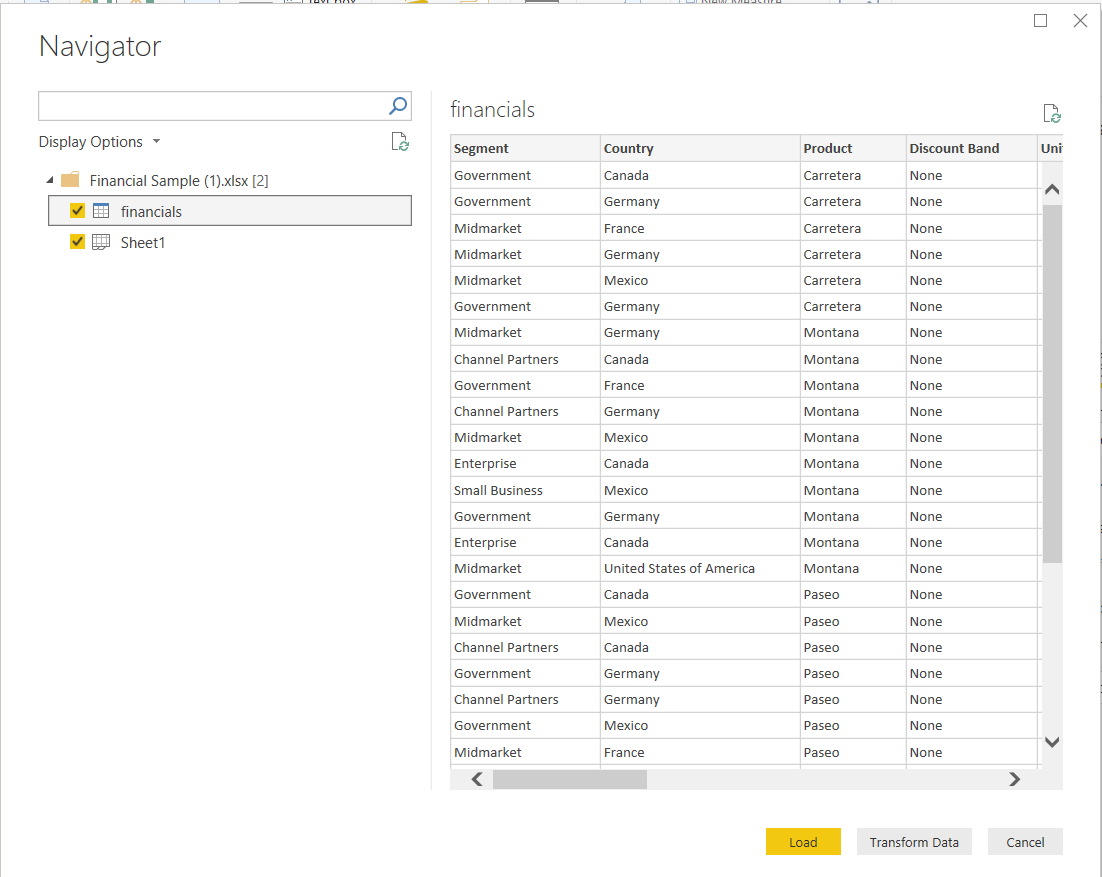
Now, the dataset is added. Power BI will ask whether to load directly or edit the dataset. We can select load as our dataset doesn’t need any change. The left side of the windows shows the sheets to be imported. We’ll select the sheet as we have only one sheet to be imported
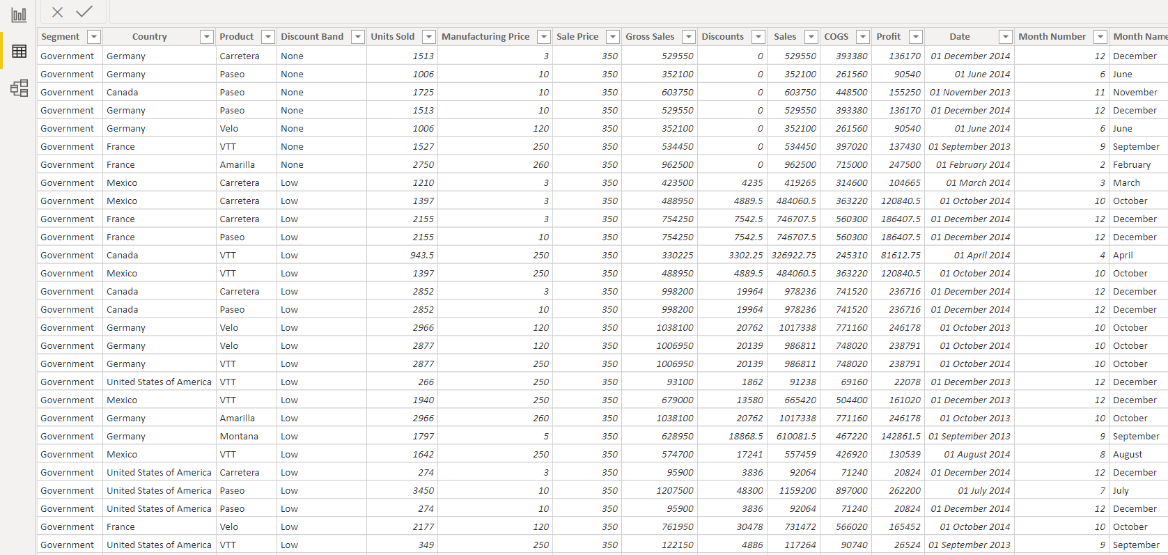
Now the same dataset can be seen on the data tab on the left-hand corner of the interface. It is a sales data of few regions as shown below.
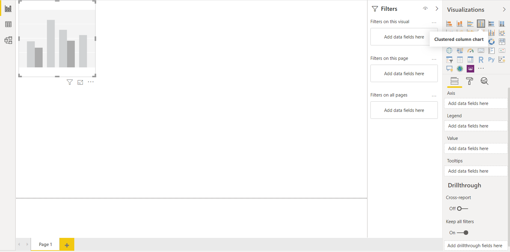
Now, we can go to the report workspace to create a report. We’ll now select the visualization. Suppose, we need a cluster column chart visualization, we’ll select that from the visualization workspace as shown below.
After that, we’ll have to select the columns we need to show in the chart. We can select sales and profit to be shown in Y-axis and data on X-axis. Power BI doesn’t have any query of choosing axis. We can just choose the fields and it will be reflected automatically on the chart as shown below.
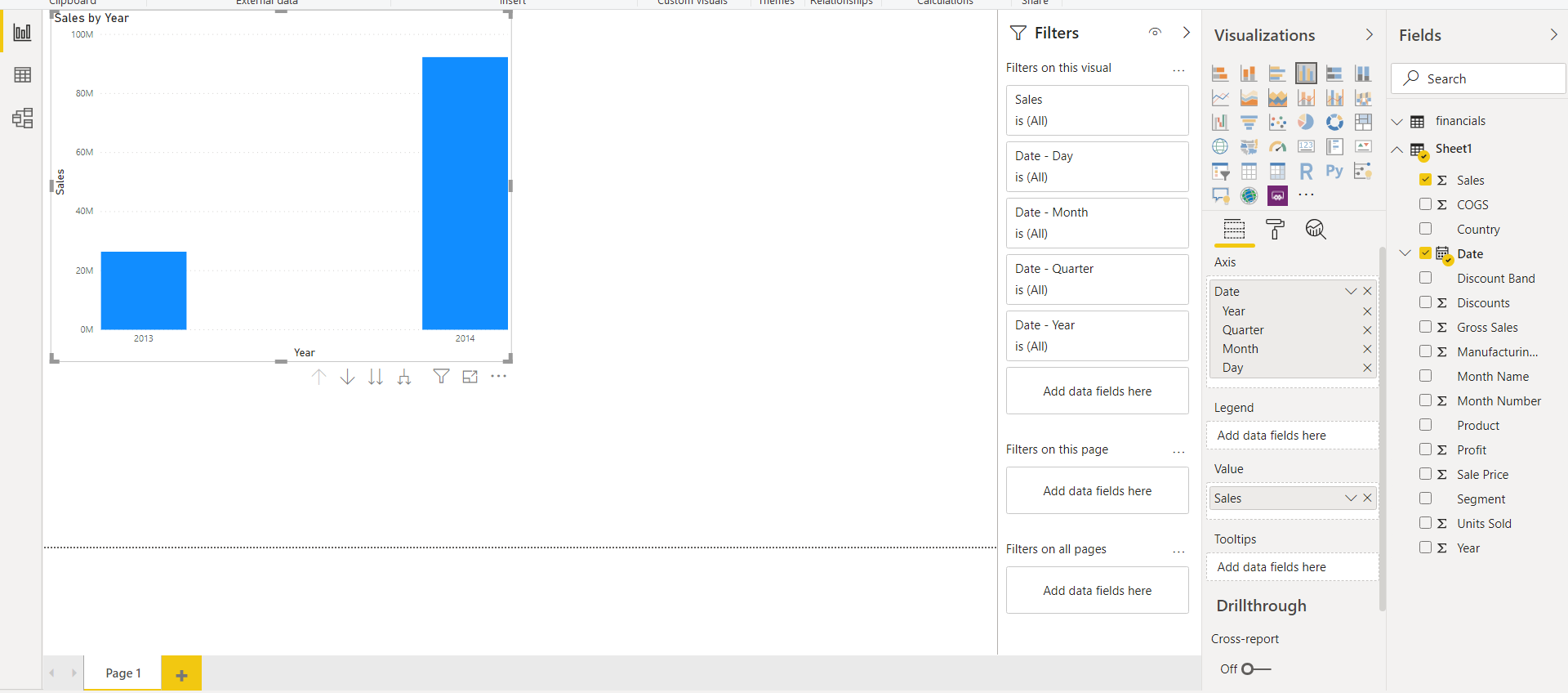
We can drag and drop fields on the visualization chart and the changes will be reflected sooner. Visualizations can be dragged from borders to make it bigger or smaller and can be placed anywhere in the workplace to make it clearer.
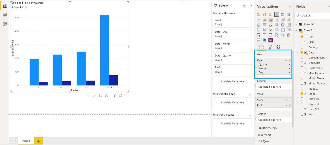
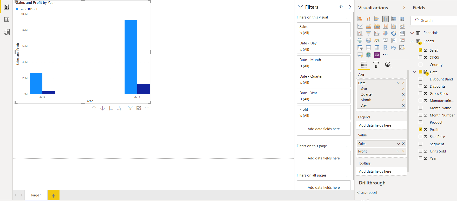 Surprisingly, we can change the graphics based on timelines by just clicking it as shown below. The yearly representation is changed to the monthly sales chart by removing the “Year” option from the “Axis” option under the “Fields” tab and the bars have been changed as well. Now, insights from the data are better and clearer.
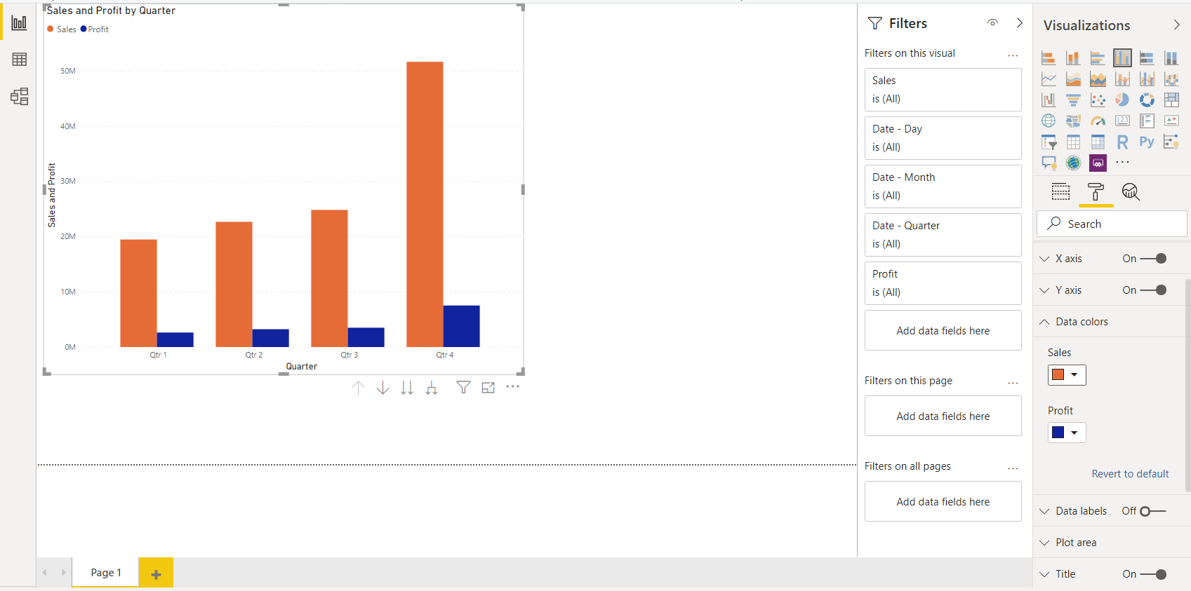
Below the visualization workspace, we can see “fields” and “format” tabs. Fields tab can be used to calculate the mean, median, sum and other statistical calculations for various parameters. Different color schemes can be applied to make the visualization more beautiful and insightful as shown below.
In this way, we can create a simple visualization. We can create a visualization in a similar manner and apply even more techniques to make it more appealing. The final step is publishing a report in Power BI. We can go to File > Publish > Publish to Power BI as shown below.
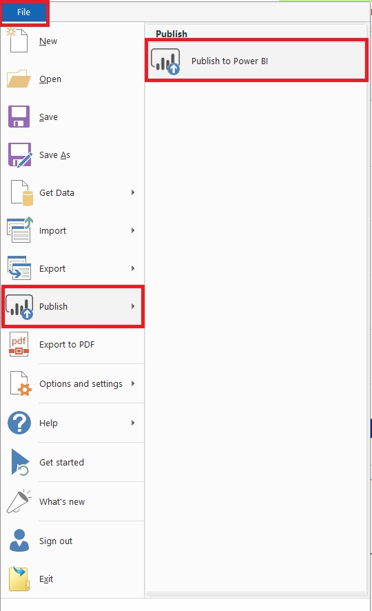
- Once the report is published, Power BI will give a link to view the report. We can view the report later. The link can be shared with other people to view it as well.
- We can choose our own visuals to create a report. As there are a lot of options, we can try those and even import some visuals like Heat-Map from the marketplace to create more effective visualization.
- After a report is created, we can export the report template by going to File > Export > Power BI Template. Later on, we can import the template again whenever we need and with some modifications, we can create another report.
Advantages of Power BI
- Minimal cost: Power BI doesn’t require to buy licenses, support, etc. Users can have access to the free version of the software to build their custom dashboards as demonstrated above. But to collaborate with colleagues, we can upgrade to the pro version which is a one-time cost.
- View Power BI reports across multiple platforms: Power BI is the best solution when it comes to viewing reports. We can view reports from any system, laptop or a mobile device as well. We can download the Power BI application from the native store of the mobile OS and view the reports created and shared with us.
- Multiple data sources: Power BI may be a Microsoft product, but it is not limited to Microsoft systems only. We can import data from various and multiple data sources. After we’ve connected to multiple data sources, we can consolidate them into a single dataset and build a report.
- Instant dashboard sharing: With the Power BI pro version, we can share the dashboards and visualization with other team members and colleagues.
- Drag & drop feature: A first time user can create a report with the drag and drop functionality. We can drag the items from the fields and drop them in the report space to create a report.
- Drill-down functionality: A drill-down report allows users to explore multidimensional data level by level in a detailed manner.
- Schedule data refresh: We can schedule our data to refresh daily or hourly in the Power BI pro version.
- Simple sentences/questions to get analysis: In Power BI, we can write simple sentences to get a quick analysis. For example, if we need total sales, we can just ask “What is total sales amount?” and the result will be displayed in the window.
- Better and bigger community: Power BI has millions of users and these subscribers can share their ideas and resolve other’s queries as well. Even developers can create visuals and share them in a community like Github etc. for others to view it.
Conclusion
Like other software, Power BI has its own set of functions and features for visualization. But it is somehow ahead than other tools like Tableau and Qlikview in the race. In the customer service market today, Analytics plays a vital role in empowering business by identifying the trends. Data can be from the financial, healthcare field but the analytical method is the same for all. Power BI is the enterprise solution to visualize large and complex data and draw insights from it. It is easy and user-friendly for users with no prior experience as well as highly skilled users. The best way is to save a report template and use it again for developing similar reports again and again. This tutorial is a simple and clearer explanation of Power BI and the process of creating reports. Every organization uses some software for analysis and visualization. But Power Bi is the cheapest and most convenient solution for creating and sharing reports for every individual.
